


A simple menu for Reveal.js
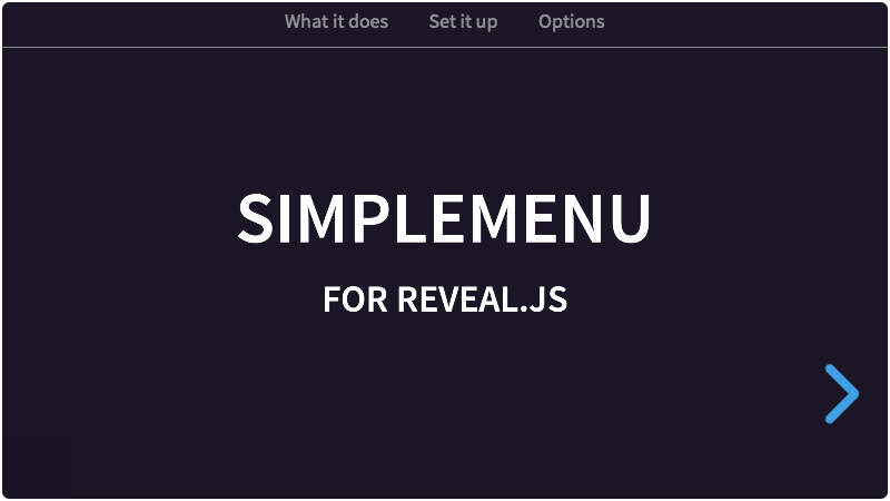
In PowerPoint you can make slides with a nice bottom- or top bar in which the active menu item is highlighted. This menu works in the same way, but automatically. Simplemenu now also supports the Markdown syntax. Combined with the barhtml option, you don't have to edit the template in HTML at all.
- Demo with bar on top
- Demo with bar on bottom
- Demo with Markdown
- Demo, styling with CSS variables
- Demo, flat chapter navigation
- Demo, manual, select by id
- Demo, manual, select by data-name
- Demo, two embedded decks on one page
- Make menu items of your vertical stacks (top-level sections).
- Moving to another vertical stack (by whatever navigation) will automatically update the current menu item.
- Clicking an item in the menu will open the first section in the corresponding vertical stack.
- Note: Menu items can only be top-level sections: regular horizontal slides or vertical stacks.
Simplemenu can generate the menu, using sections with an attribute of data-name. If you add a menubar (manually or through the barhtml option) and an empty menu, Simplemenu will automatically populate it for you. You can also add such a menu anywhere else in the presentation, to serve as a Table Of Contents or an Agenda.
Two chapters may share a data-name. The menu then gets one item for that name, and both chapters make it the active one. A chapter that should have no menu item at all gets data-sm="false", which works in any mode, not only in flat. A slide with Reveal's own data-visibility="hidden" is left out as well.
However, if you write a menu yourself and put list items in it (in a menubar or in a standalone TOC), then Simplemenu goes into "manual" mode. One menu with list items is enough: Simplemenu then fills none of them, and also does not add any menubar. The result: every menu on the page has to be written by you.
You have to take some things into account if you want to make such a menu yourself, to make menu-items actually work and activate with navigation:
- There has to be a
ulthat will hold the links. By default this selector is the classmenu. The selector can be changed in the Simplemenu options. Another element with that class, anolfor instance, is not picked up as a menu. - Inside this main menu, there have to be anchors with an href. These need to point to an ID of a top-level section. Reveal uses links with hashes to navigate, so the link has to be written like that:
href="#/firstchapter". A link with an emptyhref=""or no href at all points at no chapter, so it never becomes the active item.
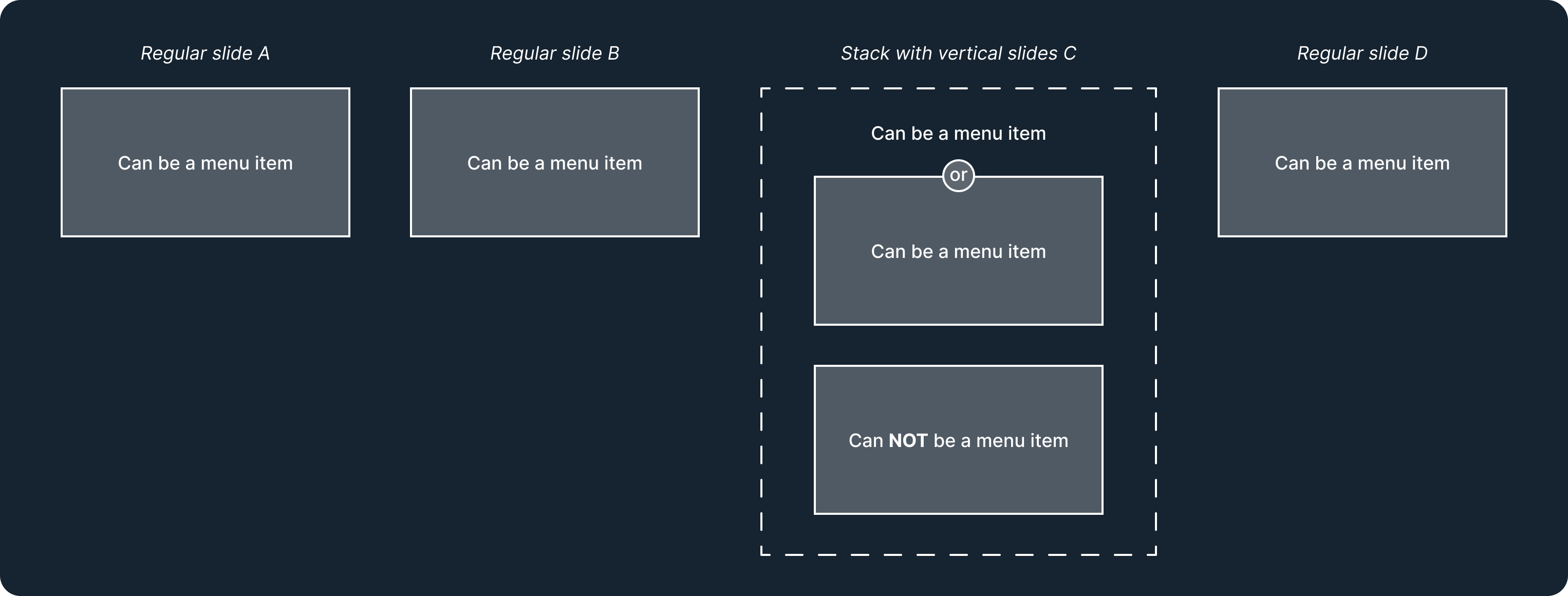

Simplemenu uses top-level slides for the menu item names. Nested slides in vertical stacks will then also use the name of the whole stack. This way you get chapters through which the user can navigate.
However, sometimes you'll want to limit your presentation to horizontal slides only. To still use 'chapters' with several slides, you can use the flat option. By default, it is set to false, but you can set it to true. Then, when a data-name is set for a slide, any following slides will keep that menu name. See Using the flat option below.
Copy the simplemenu folder to the plugins folder of the reveal.js folder, like this: plugin/simplemenu.
This plugin is published to, and can be installed from, npm.
npm install reveal.js-simplemenuThe Simplemenu plugin folder can then be referenced from node_modules/reveal.js-simplemenu/plugin/simplemenu
If you bundle your presentation, then import the plugin by its package name, and its stylesheet from the package as well:
import Reveal from "reveal.js";
import Simplemenu from "reveal.js-simplemenu";
import "reveal.js-simplemenu/simplemenu.css";
A bundler picks the module build, and Node or a require picks the UMD one. Single files can be imported by path too, such as reveal.js-simplemenu/plugin/simplemenu/simplemenu.mjs. If you import the stylesheet yourself, as above, then Simplemenu sees it and does not load a second copy.
Simplemenu needs Reveal.js 4.1 at the least, and works with 4, 5 and 6. The demos are built with the current Reveal. Scroll view arrived in Reveal 5, so a deck on Reveal 4 has none and the part of Simplemenu that follows it never comes up. It also works in setups with multiple Reveal instances: an embedded deck keeps its menubar at its own top or bottom edge, also in scroll view.
There are two JavaScript files for Simplemenu, a regular one, simplemenu.js, and a module one, simplemenu.mjs. You only need one of them:
If you're not using ES modules, for example, to be able to run your presentation from the filesystem, you can add it like this:
<script type="text/javascript" src="dist/reveal.js"></script>
<script src="plugin/simplemenu/simplemenu.js"></script>
<script>
    Reveal.initialize({
        // ...
        plugins: [ Simplemenu ]
    });
</script>If you're using ES modules, you can add it like this:
<script type="module">
    // This will need a server
    import Reveal from './dist/reveal.mjs';
    import Simplemenu from './plugin/simplemenu/simplemenu.mjs';
    Reveal.initialize({
        // ...
        plugins: [ Simplemenu ]
    });
</script>Simplemenu loads its own stylesheet, from the plugin folder or from the package, so there is nothing to include yourself.
There are two ways to change how it looks. Almost everything in the bar and the menu can be set with CSS variables. If you need to go further than the variables allow, then you can add your own rules for the menubar to the theme you are using, or point csspath at a stylesheet of your own to replace Simplemenu's.
Every rule in Simplemenu's stylesheet weighs one class, and a state adds one more, so a rule for :hover or for the current item weighs two. A rule of your own wins as soon as it has a class and an element, such as nav.menubar or a.logo, or two classes, such as .menubar .logo, wherever the two stylesheets load.
Two things weigh more than that. Reveal's theme sets the colour, underline and transition of every link, the display and margin of every list, and the size and margin of every image; for those, Simplemenu weighs one class more than the theme, so use the variables to change them. And a slide number moved into the bar is forced to display: flex, because Reveal writes that element's display into its own inline style, which no stylesheet can outweigh.
See Styling with CSS variables for a demo that uses CSS variables in the page itself.
:root {
    --simplemenu-bar-background: #004444;
    --simplemenu-item-opacity: 0.5;
    --simplemenu-item-opacity-hover: 0.8;
    --simplemenu-marker-thickness: 3px;
}| Variable | Sets | Default |
|---|---|---|
--simplemenu-bar-background |
The menubar background | transparent |
--simplemenu-bar-padding |
Inset for the menubar contents | 0 |
--simplemenu-bar-align |
How the logo, the menu and the slide number align in the menubar | stretch |
--simplemenu-bar-z |
Stacking order | 2 |
--simplemenu-bar-duration |
How long it takes to slide in and out | 0.8s |
--simplemenu-bar-easing |
The easing for the transition | cubic-bezier(0.26, 0.86, 0.44, 0.985) |
--simplemenu-bar-hidden-transform |
Where the menubar is while hidden | translateY(-100%), or translateY(100%) on a bottom menubar |
--simplemenu-bar-hidden-opacity |
How visible it is while hidden | 1 |
--simplemenu-bar-color |
Its colour on an ordinary slide | the theme's text colour |
--simplemenu-bar-color-inverted |
Its colour on a slide with the background the other way round | the theme's inverted text colour |
--simplemenu-bar-color-duration |
How long it takes to change between those two colours. Everything in the bar changes with it. | unset, so --simplemenu-item-duration |
--simplemenu-line-height |
Line height inside the menubar | 1 |
--simplemenu-font-min |
Floor of the font-size clamp | 16px |
--simplemenu-font-max |
Ceiling of it | 80px |
The menubar is transparent by default and has a border along the edge next to the slides.
| Variable | Sets | Default |
|---|---|---|
--simplemenu-rule-width |
Thickness of the border | 1px |
--simplemenu-rule-color |
Its colour | currentColor |
--simplemenu-rule-opacity |
Opacity for the border | 0.3 |
The <ul class="menu"> and every item inside it can be generated by Simplemenu, so a variable is the only way to change it.
| Variable | Sets | Default |
|---|---|---|
--simplemenu-item-opacity |
An item at rest | 0.33 |
--simplemenu-item-opacity-hover |
Hover and keyboard focus | 0.75 |
--simplemenu-item-opacity-active |
The current chapter | 1 |
--simplemenu-item-color |
An item's colour at rest | currentColor |
--simplemenu-item-color-hover |
It on hover and keyboard focus | unset, so --simplemenu-item-color |
--simplemenu-item-color-active |
The current chapter | unset, so --simplemenu-item-color |
--simplemenu-item-background |
An item's background at rest | transparent |
--simplemenu-item-background-hover |
It on hover and keyboard focus | unset, so --simplemenu-item-background |
--simplemenu-item-background-active |
The current chapter | unset, so --simplemenu-item-background |
--simplemenu-item-radius |
Corner radius of that background | 0 |
--simplemenu-item-decoration |
text-decoration on a menu link |
none |
--simplemenu-item-decoration-hover |
It on hover | unset, so --simplemenu-item-decoration |
--simplemenu-item-padding |
Padding on each item | 0.5em 1em |
--simplemenu-item-gap |
Space between items | 0 |
--simplemenu-item-duration |
How long a state change takes, opacity, colour and background alike | 0.2s |
--simplemenu-item-easing |
The curve it changes on | ease-in-out |
An item that Simplemenu could not link, because its chapter has no id to point at, is a bare <li> rather than a link. It takes the same colours, background and padding, so that the two kinds of item in one menu still match.
The menu is a flex row that the bar centres between whatever else it holds. The next 4 vars are about how it is positioned and how much room its items take.
| Variable | Sets | Default |
|---|---|---|
--simplemenu-menu-margin |
Where the menu itself sits in the menubar | 0 auto |
--simplemenu-menu-justify |
Where the items are positioned along the menu | center |
--simplemenu-item-grow |
0 leaves each item the width of its own label, 1 shares the menu's width out between them equally |
0 |
--simplemenu-item-align |
An item’s height in a menubar made taller by a logo | center |
If the (optional) marker under the current item does not line up with the edge of the bar, use --simplemenu-item-align. If you set it to stretch, each item is as high as the bar, so the marker lines up with that line. flex-start and flex-end put the item against the top or the bottom.
If a slide has a background the other way round from the rest of your deck, then the bar changes colour with it, and everything in the bar follows: the items, the line, and the marker. You do not have to set anything for that. Simplemenu asks the theme what its two text colours are and uses the one that belongs with the slide you are on.
If you want colours of your own for that case, then set --simplemenu-bar-color-inverted, and --simplemenu-marker-color-inverted for the marker. You should not need to: the bar follows the theme's text colour and the marker follows its heading colour, and both are asked of the theme for the slide you are on. The names are about your theme, not about light and dark, so they read the same whether your deck is dark with the odd light slide or light with the odd dark one.
For anything else you want to turn around on those slides, Simplemenu puts the class c-theme-inverted on the viewport for as long as one is showing, and your own CSS can use it. The viewport is the body for a deck that has the page to itself, and the deck's own element when it is embedded, so a page with two decks keeps them apart. A theme does not keep its inverted colour in a variable, it just sets it, which is why the class is there to be read rather than a value.
These variables are about how the bar and the menu move when a slide hides them with hide-menubar or hide-menu. See Hiding the bar or the menu on a slide for how to do that.
hide-menubar uses the bar’s own timing, --simplemenu-bar-duration and --simplemenu-bar-easing from the table above.
By default the bar slides out of view. You can also fade instead of transform, or you can use both at the same time. Fading:
:root {
    --simplemenu-bar-hidden-transform: none;
    --simplemenu-bar-hidden-opacity: 0;
}
The menu has its own timing:
| Variable | Sets | Default |
|---|---|---|
--simplemenu-menu-duration |
How long the menu takes to fade out and back in | 0.2s |
--simplemenu-menu-easing |
The curve it fades on | ease-in-out |
By default, Simplemenu shows inactive chapters with opacity and the active chapter being fully opaque. But you can also give it a 'tab' line, a marker, under the active item. There is no marker under it until you give one a size.
| Variable | Sets | Default |
|---|---|---|
--simplemenu-marker-thickness |
Thickness/size of the marker, and whether it appears at all | 0 |
--simplemenu-marker-color |
Its colour | the theme's heading colour |
--simplemenu-marker-color-inverted |
Its colour on a slide with the background the other way round | --simplemenu-marker-color |
--simplemenu-marker-radius |
Its corner radius | 0 |
--simplemenu-marker-edge |
Which edge it is on | auto 0 |
--simplemenu-marker-margin-x |
Space on the left and the right of it | 0, so the whole width |
The marker takes the colour your theme gives its headings, so it comes out as the theme's accent rather than the colour of the menu text. On moon that is #eee8d5 against #93a1a1 body text, and on dracula it is the purple #bd93f9. On a slide with the background the other way round it follows the theme there too, so you do not have to set anything for that either.
If you want a colour of your own, then set --simplemenu-marker-color. That one is used on ordinary slides and on inverted ones alike, so if you want a different colour when the background turns around, then set --simplemenu-marker-color-inverted as well. A colour picked against your theme is the case to watch: it stays as you set it while the background flips, which is what the second variable is for.
:root {
    --simplemenu-marker-color: #008080;
    --simplemenu-marker-color-inverted: #cddddd;
}
--simplemenu-marker-edge takes two values, the start and the end. auto 0 puts the marker along the item’s bottom edge, and 0 auto puts it along the top. Those two are the values you want; it is an inset-block, so a keyword such as top does not work. A menubar with the bottom class flips it to the top edge on its own, so that the marker faces the slides either way, and setting the variable overrides that.
Simplemenu does not add a logo for you. That would not make any sense. If you want one, then put it in your barhtml and give the class logo to the element around the image, such as the link, not to the image itself. The Simplemenu CSS styling sizes the image, so that a big one does not make the bar tall, and gives the logo some room.
| Variable | Sets | Default |
|---|---|---|
--simplemenu-logo-width |
Width of the box around the logo | auto |
--simplemenu-logo-maxheight |
Maximum on the image's height | 1.8em |
--simplemenu-logo-maxwidth |
Maximum on its width | none |
--simplemenu-logo-padding |
Padding inside the box around the logo | 0.4em 0, or 0 in a padbox |
--simplemenu-logo-margin |
Margin on the image itself | 0 |
--simplemenu-logo-color |
A colour for a logo that draws itself in currentColor |
unset, so it takes the bar's |
--simplemenu-logo-color-inverted |
The same on a slide with the background the other way round | unset, so --simplemenu-logo-color again |
A logo is sized by its height by default. If you want to size it by its width instead, then set --simplemenu-logo-width and --simplemenu-logo-maxwidth: 100%.
If you put the logo in a padbox, described below, then the padbox gives it its room and the logo gets no padding of its own. If you set --simplemenu-logo-padding, then it applies either way.
A logo is a brand mark, not a label, so Simplemenu leaves its colours alone. It does not get the menu's colour, and it is never dimmed and never reacts to the pointer, even though it usually is a link. Most logos have one version and one set of colours, and turning those around on a dark slide would be wrong far more often than it would be right. Simplemenu only stops the theme's link colour from reaching it.
What you do want depends on the logo you have, so it is worth asking two questions about it.
Is there a second version of the logo, for backgrounds the other way round than your theme's? Then put both in the bar and let the class do the swap. Simplemenu adds c-theme-inverted to the deck while such a slide is showing. On a dark theme that second version is the one for light slides, and on a light theme it is the other way round, which is why the names below say nothing about light or dark.
<a class="logo" href="#">
    <img class="regular" src="logo.svg" alt="Acme">
    <img class="inverted" src="logo-inverted.svg" alt="" aria-hidden="true">
</a>
regular and inverted are names you pick yourself; Simplemenu only supplies the class on the deck.
.logo .inverted {
    display: none;
}

.c-theme-inverted .logo .regular {
    display: none;
}

.c-theme-inverted .logo .inverted {
    display: block;
}
Is there no second version, but a colour you want the whole logo to take? Then the logo has to be drawn in a colour rather than be a picture of one: an inline SVG that fills with currentColor, or a mask painted with it.
.logo {
    background: currentColor;
    mask: url(logo.svg) center / contain no-repeat;
}
Either way the logo follows the bar, which is the theme's text colour and turns around on its own, so you need to set nothing at all. If your logo has a brand colour of its own, then set the pair:
:root {
    --simplemenu-logo-color: darkgreen;
    --simplemenu-logo-color-inverted: lightgreen;
}
--simplemenu-logo-color applies everywhere on its own, which suits a mark that works on both backgrounds. If that colour is wrong once the background turns around, then --simplemenu-logo-color-inverted is the one for those slides.
Neither variable reaches a logo with its colours baked in, such as a multicolour SVG or a PNG. Nothing can recolour those, so they need the swap above, or nothing at all.
Which class to hang that on. Simplemenu puts c-theme-inverted on the viewport, the body or the deck itself, for as long as a slide is showing whose background goes the other way round than the theme. That is the question you are asking here, and it also covers a slide that takes its background from the stack around it, which Reveal marks nowhere, and the pages of a PDF export. Reveal's own has-light-background and has-dark-background answer a different question, whether a background is light or dark, so a light slide in a light deck carries one of them while nothing about it is inverted.
Neither? Then it stays exactly as it is, which is the default.
<nav class="menubar">
    <div class="padbox"><a class="logo" href="#"><img src="logo.svg"></a></div>
    <ul class="menu"></ul>
</nav>A menubar often holds more than the menu: a logo, a language chooser, a fullscreen button, a set of buttons. Put them in your barhtml inside an element with the class padbox, and Simplemenu pads it for you. The padding is half of what a menu item gets by default, which suits a button or a chooser better than a full item's spacing. It does not change when you set --simplemenu-item-padding.
| Variable | Sets | Default |
|---|---|---|
--simplemenu-bar-padbox |
Padding inside a padbox |
0.25em 0.5em, half of an item's default padding |
A padbox is given no width, because how it should share the bar depends on your deck. Two common cases:
If you want the menu in the middle of the bar, then put an empty padbox on the other side of it and give both flex: 1 1 0 and min-width: 0. Both sides are then the same width whatever is in them, and the menu stays centred. Without min-width: 0 anything in them that cannot wrap, such as a name with white-space: nowrap, makes that side wider and the menu moves off centre.
If you want a box only as wide as what is in it, then leave it alone. It is already a flex row, so its contents sit in a line and are centred top to bottom.
<nav class="menubar">
    <div class="padbox"><a class="logo" href="#"><img src="logo.svg"></a></div>
    <ul class="menu"></ul>
    <div class="padbox"><div class="slide-number"></div></div>
</nav>
A slide number has a trailing space of its own, --simplemenu-slidenumber-padding, for when it sits in the bar by itself. If you put it in a padbox, then set that to 0 so the two do not add up.
If you add a menubar manually or through the options, you can also move the slide number into it. These are the CSS vars to style it:
| Variable | Sets | Default |
|---|---|---|
--simplemenu-link-padding |
For any other link in the bar | 0.4em 0 |
--simplemenu-focus-width |
Thickness of the keyboard focus ring | 2px |
--simplemenu-focus-color |
Its colour | currentColor |
--simplemenu-focus-radius |
Its corner radius | 0.2em |
--simplemenu-slidenumber-size |
Size of the slide number | 0.75em |
--simplemenu-slidenumber-minwidth |
Holds its width as the number changes | 4em |
--simplemenu-slidenumber-padding |
Trailing space after it | 0 1em 0 0 |
--simplemenu-slidenumber-opacity |
The slide number at rest | unset, so --simplemenu-item-opacity, then 0.75 |
--simplemenu-slidenumber-opacity-hover |
It on hover | unset, so --simplemenu-item-opacity-hover, then 1 |
The two opacities for the slide number are unset, so the number uses the same values as the menu items and matches them without a second edit. If you set them, the number uses your values instead. These only apply to a slide number that you have moved into the bar. A slide number left in its normal place is not styled by Simplemenu at all.
Simplemenu finds and loads its own stylesheet, so most decks never set anything here. If it cannot find it, maybe because the plugin is in a bundle, or it is somewhere the plugin cannot work out, then use csspath.
simplemenu: {
    csspath: "plugin/simplemenu/simplemenu.css"
}
If you import the stylesheet yourself, then set csspath: false so that Simplemenu does not load a second copy. A stylesheet of your own can also say so, which is useful when you cannot reach the plugin’s options:
:root {
    --cssimported-simplemenu: true;
}
csspath loads that file instead of Simplemenu’s own. If you do write your own CSS, then make sure to use simplemenu-bar and simplemenu-menu for the bar and the menu respectively.
It is easy to set up your HTML structure for Simplemenu. To keep the Simplemenu on every slide, put it outside of the .slides. Simplemenu can automatically do this for you if you use the barhtml option, so that you do not need to edit the template.
Start by giving data-names to your sections:
<div class="slides">
    <section data-name="Menu item one">
        //...
    </section>
    <section data-name="Menu item two">
        //...
    </section>
    <section data-name="Menu item three">
        //...
    </section>
</div>
That is already enough for a menubar: Simplemenu adds a header bar with an empty menu in it, and fills that menu with links to your sections.
If you want a different bar, you can set your own through the options like this (yes, even when you use Markdown, you have to write a small piece of HTML here). What you set replaces the default bar instead of being added to it, so a barhtml with only a footer in it leaves your deck without a header bar. If you want both, write both entries:
Reveal.initialize({
    // ...
    simplemenu: {
        // ...
        barhtml: {
            header: "<nav class='menubar'><ul class='menu'></ul></nav>",
            footer: ""
        }
    },
    plugins: [ Simplemenu ]
});
...or manually in your markup like this:
<nav class="menubar">
    <ul class="menu"></ul> <!-- Keep this empty -->
</nav>
<div class="slides">
    <section data-name="Menu item one">
        //...
    </section>
    <section data-name="Menu item two">
        //...
    </section>
    <section data-name="Menu item three">
        //...
    </section>
</div>
A bar you supply yourself is recognised, and Simplemenu then does not add one of its own. It counts as yours when it has the menubarclass, or when there is a menu inside it for Simplemenu to fill. A menu inside the slides counts as a table of contents rather than a bar, so Simplemenu still fills it with section links, and the menubar stays as well.
A bar that Simplemenu makes from barhtml gets a class to style it by, simplemenu-headerbar for the header and simplemenu-footerbar for the footer, and the same name as its data-name, which is the key Internation looks up for anything in the bar. It gets no id, because a page with several decks would then have the same id more than once. If you give the bar an id or a data-name yourself, in your markup or in barhtml, then Simplemenu keeps it.
Each menu item links to its chapter by the chapter's id. If a chapter has no id, then Simplemenu makes one from its name: in lower case, without spaces or punctuation, so "Set it up" becomes setitup. If the page already has that id, then Simplemenu adds -2, -3 and so on, so chapters called "Why?" and "Why" link to #/why and #/why-2. On a page with several decks, the deck that starts first keeps the plain ids. An id you wrote yourself is never changed.
If you write your bar after .slides, then Simplemenu treats it as a bottom bar. Simplemenu puts every bar that is outside the slides into an element with the class simplemenu-anchor, which holds it at the top or bottom edge of the deck. If your own CSS selects the bar as a direct child of .reveal, then that rule no longer matches it.
A bar from barhtml does not exist until Simplemenu has run. If you use the barhtml entry, then make sure to load Simplemenu before any other plugin that needs to know about the rendered content of the menubar.
The Markdown plugin goes the other way round: it turns your Markdown into sections, and Simplemenu needs those sections before it can read their names. If you use Markdown, then RevealMarkdown has to come before Simplemenu in the plugins array, because Reveal runs them in that order.
<nav class="menubar">
    <ul class="menu">
        <!-- Here's the menu -->
        <li><a href="#/firstchapter">First chapter</a></li>
        <li><a href="#/secondchapter">Second chapter</a></li>
        <li><a href="#/thirdchapter">Third chapter</a></li>
    </ul>
</nav>
<div class="slides">
    ...
</div>
The top-level sections (that should be in the menu) need to have an ID:
<div class="slides">
    <section id="firstchapter">
        <section>
            <h2>This is 1</h2>
        </section>
        <section>
            <h4>Lorem ipsum dolor sit amet, consectetur adipiscing elit.</h4>
        </section>
    </section>
    <section id="secondchapter">
        <h2>This is 2, no child slides</h2>
    </section>
    <section id="thirdchapter">
        <section>
            <h2>This is 3</h2>
        </section>
        <section>
            <h4>Lorem ipsum dolor sit amet, consectetur adipiscing elit.</h4>
        </section>
    </section>
</div>
This manual way can also use the data-name of the sections, which will then link if the link text is exactly the same as the data-name. Set the selectby: "data-name" option if you set it up like that.
Simplemenu also supports Markdown, but you need to consider how you add data-names to your sections. Because of the way how Reveal generates vertical stacks, you can't directly add a data-name to those. The workaround is to add a data-stack-name to the first vertical slide in those stacks:
# Simplemenu
### for Reveal.js
Using Markdown
---
### Table of Contents
<ul class="menu"></ul>
---
<!-- .slide: data-name="Regular slide" -->
## Slide 1
A paragraph with some text and a [link](http://hakim.se).
---
<!-- .slide: data-stack-name="Vertical" -->
## Vertical slide 1
----
## Vertical slide 2
The above example is from an externally loaded Markdown file, with the vertical separator specifically set to \n----\n, but any setup will work.
data-stack-name is only needed for vertical stacks. On a slide that is not in a stack, data-name is the one to write. Simplemenu copies a resolved stack name onto the stack itself as a data-name, so the finished page looks the same as a hand-written one, and so another plugin can read it there.
If you use Quarto, the syntax of the Markdown is a little bit different:
## Table of Contents
<ul class="menu"></ul>

# Slide 1 {data-name="Regular slide"}
A paragraph with some text and a [link](http://hakim.se).

# Vertical slide 1 {data-stack-name="Vertical"}

## Vertical slide 2If you want the menubar or the menu out of the way on one slide, such as a title slide, then give that slide a data-state:
data-state |
Does |
|---|---|
hide-menubar |
Hides the whole bar, logo and slide number with it. By default the bar slides out of view. |
hide-menu |
Fades the menu out, and leaves the rest of the bar where it is |
<div class="slides">
    <section data-state="hide-menubar">
        <h1>My presentation</h1>
    </section>
    <section data-name="What it does">
        //...
    </section>
    <section data-name="Thank you" data-state="hide-menu">
        //...
    </section>
</div>
In Markdown, the state goes in the comment for the slide:
<!-- .slide: data-state="hide-menubar" -->
# My presentation
A state on a vertical stack applies to every slide in that stack. The states also work in Reveal's scroll view, where Reveal itself sets no state classes, for each deck separately on a page with several embedded decks, and in a PDF export with ?print-pdf.
If you want to change how the bar and the menu move while they hide, then see Hiding the bar, or hiding the menu under Styling.
If you add a menubar manually or through the options, you can also move the slide number into it. If a div with the class slide-number is found within a menubar, it is removed from the root Reveal element, and used in that menubar. This functionality is similar to the RelativeNumber plugin. Simplemenu restyles the number for its place in the bar, so you do not have to; its variables are in Links, the focus ring and the slide number.
Reveal only fills that element when its own slideNumber option is on. If it is off, then the element stays empty and Simplemenu leaves it out of the bar, so it takes no room.
Reveal hides its slide number in scroll view and does not keep it up to date there, so Simplemenu hides the one in the bar as well. If it stayed, then it would show the number of whichever slide was current when scroll view started.
Reveal's controls move in the same way: a div with the class controls in a menubar is where Reveal's own controls end up. Simplemenu does not restyle those, so they keep the arrows and the colours Reveal gives them.
Reveal.initialize({
    // ...
    simplemenu: {
        // ...
        barhtml: {
            header: "<nav class='menubar'><ul class='menu'></ul><div class='slide-number'></div></nav>",
            footer: ""
        }
    },
    plugins: [ Simplemenu ]
});Sometimes you'll want to limit your presentation to horizontal slides only. To still use 'chapters' with several slides, you can use the flat option. By default, it is set to false, but you can set it to true. Then, when a data-name is set for a slide, any following slides will keep that menu name. Whenever a slide is encountered with data-sm="false", the inheritance will stop.
<nav class="menubar">
    <ul class="menu"></ul> <!-- Keep this empty -->
</nav>
<div class="slides">
    <section data-name="Chapter 1">
        //... (Chapter 1 will be active)
    </section>
    <section>
        //... (Chapter 1 will be active)
    </section>
    <section data-name="Chapter 2">
        //... (Chapter 2 will be active)
    </section>
    <section>
        //... (Chapter 2 will be active)
    </section>
    <section data-sm="false">
        //... (No menu item will be active)
    </section>
</div>There are a few options that you can change from the Reveal.js options. The values below are default and do not need to be set if they are not changed.
Reveal.initialize({
    // ...
    simplemenu: {
        menubarclass: "menubar",
        menuclass: "menu",
        activeclass: "active",
        activeelement: "li",
        selectby: "id",
        barhtml: {
            header: "<nav class='menubar'><ul class='menu'></ul></nav>",
            footer: ""
        },
        flat: false,
        scale: 0.67,
        cssautoload: true,
        csspath: ""
   },
    plugins: [ Simplemenu ]
});menubarclass: This option sets the classname of menubars. It is also how Simplemenu recognises a bar you supplied yourself. Change it if another plugin already uses that name. Simplemenu still styles the bar, because it writessimplemenu-baronto it as well.menuclass: This option sets the classname of the menu. Change it if another plugin already uses that name. Simplemenu still styles the menu, because it writessimplemenu-menuonto it as well.activeclass: This option is the class an active menuitem gets.activeelement: This option sets the element that gets the active class. Change it if you directly want to style thea, for example.selectby: This option is only needed when adding a menu manually. You then need to link sections to the menu items. The selectby option finds the active slide or stack by this. By default, it selects by ID, but it can also be set todata-name. In that case, Simplemenu will compare the text content of your links to the data-name of the section. This only will work if you disable the auto-generation of the menu by adding the menu and menu-items manually.barhtml: If your deck has no menubar, then Simplemenu adds one. The default markup uses yourmenubarclassandmenuclass. If you setbarhtmlyourself, then Simplemenu uses your markup exactly as it is, so the classes in it have to be the ones you set. If another plugin needs to see what is in that bar, then it has to be loaded after Simplemenu. See Plugin order.header: Here you can add the HTML for the header. If you include an empty menu in it, that will be populated with actual links. You might also add a logo here, or anything else you like. If you give the logo the classlogo, then Simplemenu sizes it for you. A header bar is added by default, so if you would rather have no bar at all, you can set this to an empty string. If you give the bar an id, that id is kept.footer: Here you can add the HTML for the footer. If you include an empty menu in it, that will be populated with actual links. You might also add a logo here, or anything else you like. There is no footer by default.
flat: This turns theflatoption on or off. See the description above.scale: When you have a lot of subjects/chapters in your menubar, they might not all fit in a row. To avoid the need to adjust the CSS for each presentation, you can tweak the scale in the options. It is set to be two-thirds of the main scaling.cssautoload: Simplemenu loads its own stylesheet when this is on. If you bundle Simplemenu, or import its CSS yourself, it works this out and does not load a second copy, so this normally does not need setting. If you do want it to autoload in a bundled deck, then setting it totrueyourself turns it back on.csspath: Where Simplemenu's stylesheet is, for the cases where it cannot find it by itself. You can also setcsspath: falseif the styling is already on the page through some other file. For changing how the menubar looks, use the CSS variables instead.debug: Prints what Simplemenu is doing to the console: which mode it is in, the map it built of your slides, and the events it acts on. Off unless you set it, and Reveal's owndebugswitches it on as well.rtl: The menubar is laid out right to left for right-to-left presentations: the menu items start on the right, and anything else in the bar changes sides too. By default the bar follows Reveal's ownrtlsetting, also when that changes during the presentation, for example when Internation switches to a right-to-left language and back. If you setrtlyourself, then the bar keeps that direction whatever Reveal's setting is. A menu inside your slides keeps its document order either way.
If you like it, please star this repo!
And if you want to show off what you made with it, please do :-)
MIT licensed
Copyright (C) 2026 Martijn De Jongh (Martino)